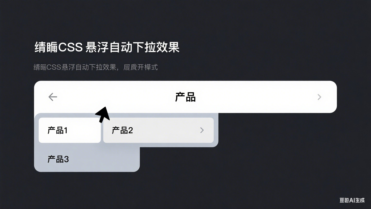
HTML
<div id="box">
        <div class="box boxVisible">显示的部分</div>
        <div class="box boxHidden">
            <ul>
                <li>第一行</li>
                <li>第二行</li>
                <li>第三行</li>
                <li>第四行</li>
                <li>第五行</li>
                <li>第六行</li>
            </ul>
        </div>
    </div>
CSS
* {
        margin: 0;
        padding: 0;
    }

    li {
        list-style-type: none;
    }
	//父容器
    #box {
        width: 200px;
    }

    .box {
        width: 100%;
        background-color: rgba(125, 125, 125, 0.5);
        text-align: center;
        cursor: pointer;
    }

    .box.boxVisible {
        height: 100%;
        line-height: 50px;
        border-radius: 15px;
        /* opacity: 0.5; */
    }

    .box.boxHidden {
        visibility: hidden;
        border-bottom-left-radius: 15px;
        border-bottom-right-radius: 15px;
        transition: border, fast;
        -moz-transition: border, fast;
        /* Firefox 4 */
        -webkit-transition: border, fast;
        /* Safari and Chrome */
        -o-transition: border, fast;
    }

    .box.boxHidden ul li {
        height: 0;
        opacity: 0;
        transition: height 0.3s, opacity 1s, fast;
        -moz-transition: height 0.3s, opacity 1s, fast;
        /* Firefox 4 */
        -webkit-transition: height 0.3s, opacity 1s, fast;
        /* Safari and Chrome */
        -o-transition: height 0.3s, opacity 1s, fast;
        /* Opera */
    }

    .box.boxHidden ul li {
        line-height: 50px;
    }
	//父容器hover时分别触发不同子元素
    #box:hover .box.boxVisible {
        opacity: 1;
        border-bottom-left-radius: 0;
        border-bottom-right-radius: 0;
    }

    #box:hover .box.boxHidden {
        /* Safari and Chrome */
        visibility: visible;
    }

    #box:hover .box.boxHidden ul li {
        height: 50px;
        opacity: 1;
    }